AIMING HIGH WITH A
NEW OPERATING SYSTEM
In wind and weather, day and night: operating a tower crane must be safe and precise. This is exactly what LIEBHERR and UID have achieved together: with the new system, fitters and crane operators can navigate conveniently through a well thought-out menu structure. They are supported by a clear design with unmistakable icons. The joint project by LIEBHERR and UID received the iF DESIGN AWARD in 2023.
Aesthetic on-off in the construction site area
Aesthetic on-off in the construction site area
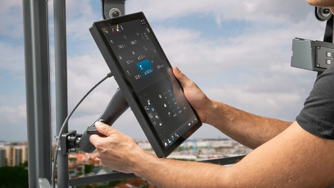
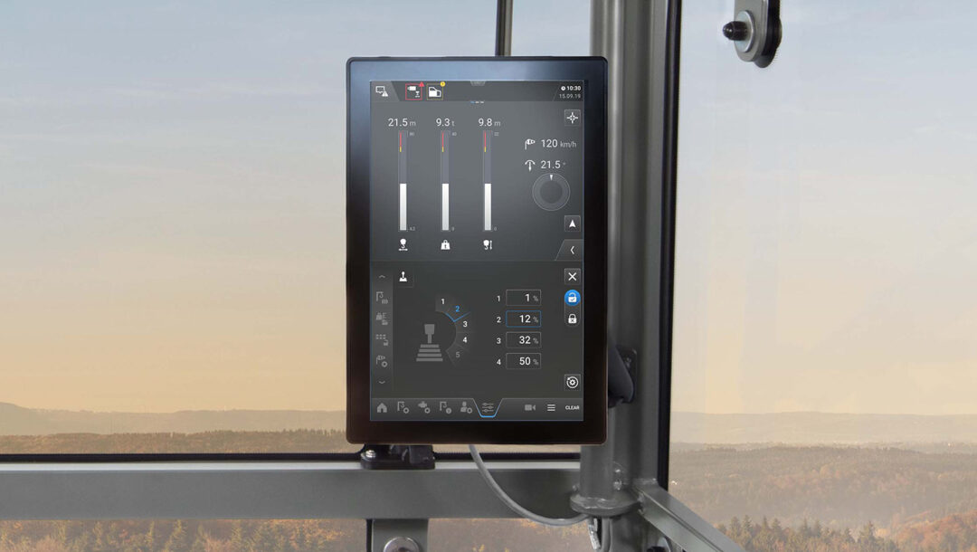
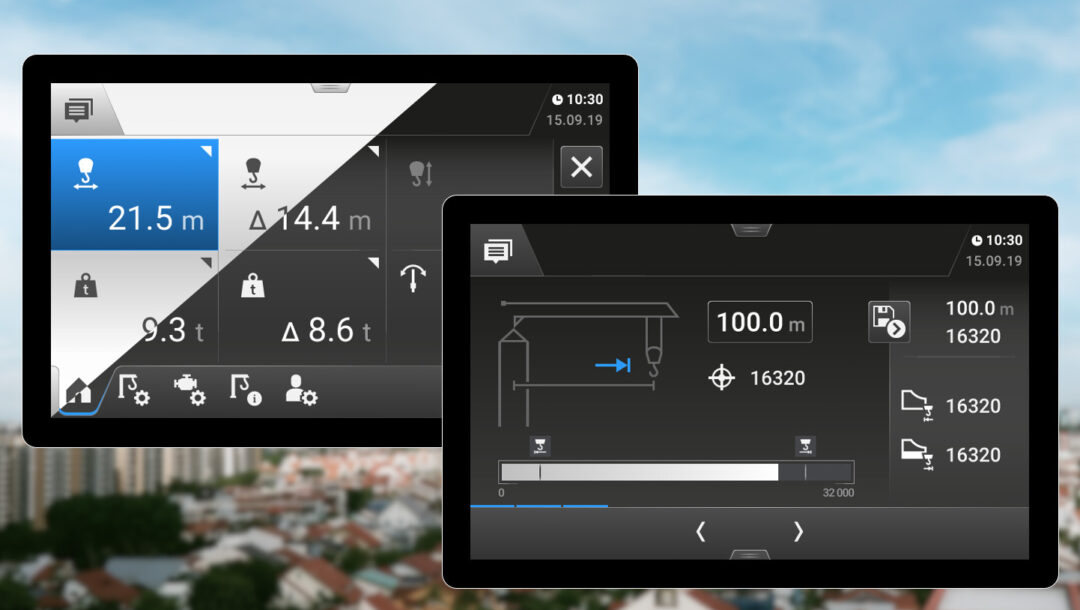
LIEBHERR is one of the world’s largest suppliers of tower cranes. The new Tower Crane Operating System, a multi-touch operating system for 12-inch displays, is a major leap forward in terms of intuitive operation and ease of use. Together with LIEBHERR, we have been working on the operation since 2018. Crane operators and fitters can now navigate safely and quickly through the application, which requires almost no text.
“
“I really like the new user interface: easy to understand, logically structured and tailored to the different users. Everything is much faster. I’m very familiar with the tapping and swiping controls from my tablet and smartphone.”
Liebherr employee Viktor Zhezher
The process
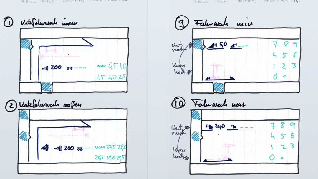
The new user interface was created in a classic user-centered design process: wireframes were followed by the elaborated concept and the visual design. User tests showed where improvements could still be made.
The team
We are particularly pleased about the long-standing and constructive collaboration with LIEBHERR on this project. The new user interface is a great joint achievement: using an agile approach, a viable, user-friendly concept and an appealing screen design were created in weekly feedback loops. We are looking forward to the follow-up projects that are already in the starting blocks.
Icons: matching the brand
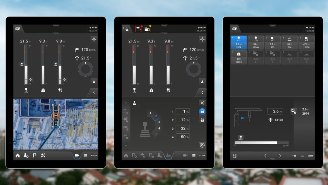
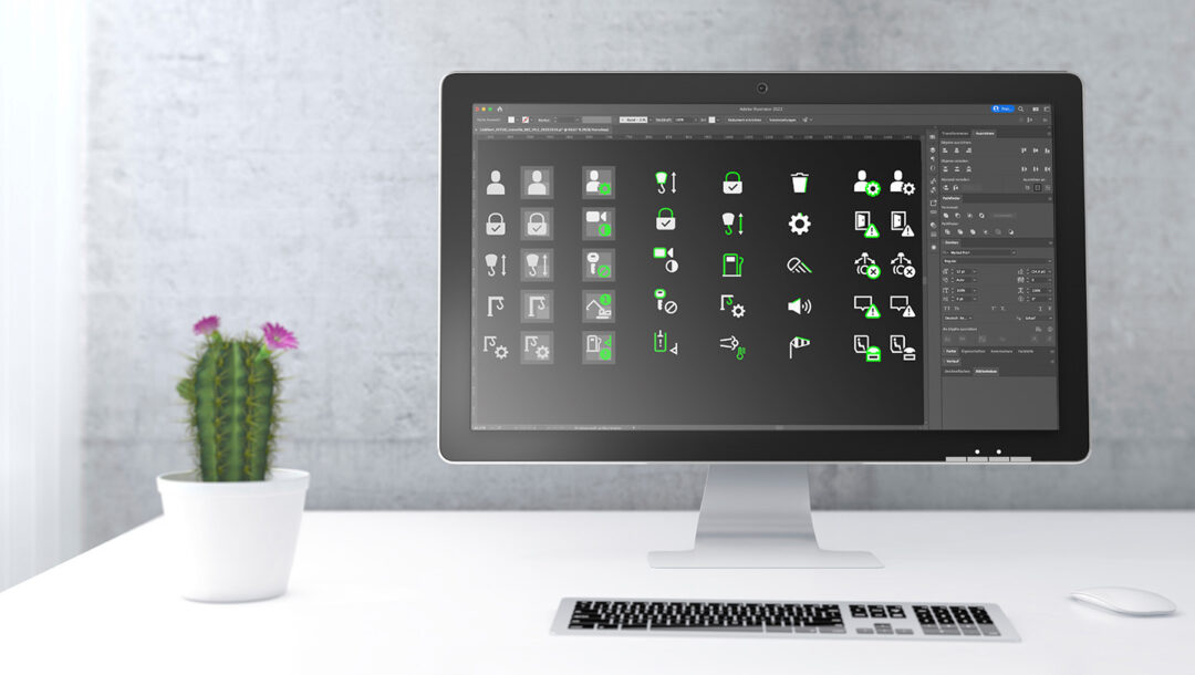
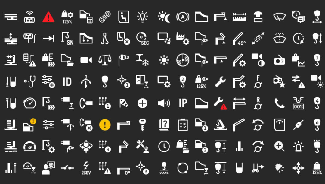
Thanks to the sophisticated icon design, the new control system manages almost completely without text. We defined a uniform look for over 300 icons in different states. Clear icons in a 2-dimensional style, reduced to the essentials, now facilitate safe operation. A design that radiates the high quality standards of the LIEBHERR brand!
Final touch: Usability test
We found out whether the users’ needs were met during several usability tests at the LIEBHERR training center and outside in Biberach. We tested the new interface with the real operating elements with crane operators and service technicians. This enabled us to further optimize the control system.
Simple: One thing per screen
It should be clear and unambiguous: That’s why we have looked again and again for ways to reduce the complexity. For example, a 10-step wizard guides you through the configuration of the crane: the system requires exactly one piece of information per screen from the user, who can navigate using progress bars.
Good view: All in sight
There are different modes for working during the day and at night. This makes it easy for crane operators to navigate through the application, even in confusing external conditions. A space-saving menu at the bottom of the screen is always available and allows quick and safe switching between individual areas.


